I believe that of all of this year's projects, my most successful work was my final landscape painting. I developed my ability to focus on small details rather than try to absorb everything at once and get ahead of myself. I used oil paint for the first time with this project, which I actually really liked because of its consistency and the ease with which I could spread it and change its thickness. In creating my piece, I wanted to create a feeling of calmness and serenity, which I did by not using very many harsh brush strokes, and mixing my colors pretty thoroughly within an object so that there wasn't too much blatant contrast between different areas (unless they were different objects).
I think that the most challenging piece this year for me was my silhouette ink drawing. Looking at my preliminary sketches, they were all very detailed, and weren't really silhouettes. I think that I was just trying to get a sense of the subject itself, but I didn't focus on the outline as much as the details inside. In the final ink drawing, I did focus more on the actual silhouette, instead of all of the minute details, which made it a pretty different style. This was actually fine and I'm happy with the outcome of the project, but the silhouette of the tree that I chose proved to be extremely detailed itself, and was extremely tedious and time-consuming to be copied five different times. There wasn't much to be done about this problem except to dive in and put in th necessary time to finish it--I had already committed to this silhouette and I really liked it, it was just hard to stay that focused for that amount of time. However, I did it and it turned out pretty well.
This year, I think that a formal skill I have developed has been my ability to work with different values, and my color-mixing abilities. I've painted more this year than I did last year, so I've had more opportunities to practice these skills, and I am proud of my progress in color mixing and creating realistic values for the subjects that I paint. A technical strength I have improved has been my ability to hone in on specific details of a piece and put in a lot of concentrated effort on those small areas, rather than try to concentrate fully on the entire piece at once, which can be overwhelming and hard to focus on all at once. A conceptual strength that I have developed over the course of the year is my ability to create a piece of art that conveys an emotion. I think that I've become much better at using certain kinds of brush strokes and color variations in order to express a feeling, such as in my artist emulation project, when I used a scene of a lighthouse blocking an ocean view in order to convey the idea that mandate objects are obstructing natural beauty.
Monday, June 3, 2013

Landscape Final Reflection
My intentions for this project were to communicate a realistic sense of the light in the landscape. I think that adding a realistic light element in my scene really helped to define the different values in my painting, because it added variation to the different shades of green. If I hadn't used the light to enhance the color scale then it would have been a lot more bland and monochromatic.
I addressed my self-defined theme of landscape by including a foreground and a background in my painting, and by covering a pretty large area of space in my painting. I also think that I used my artistic voice by portraying the scene pretty realistically, except for a few details, like the texture of the large tree on the right.
In our feedback discussion, I received comments about the light on the bushes, and the texture on the trees--which were details that I focused on, so I would consider my work pretty successful in terms of accomplishing my intentions.
I think that in this project, I was able to improve as an artist by developing my ability to focus finitely on one aspect or detail of my work at a time. I think that for many of my past works, I have tried to bring everything together too soon, and I focused on how the whole painting would look at the end of the project. However, through this project I learned to direct my focus on one small thing at a time, and take it little by little in order to create an end product that I am satisfied with. This did a pretty good job of representing my formal/technical strides over the course of this year, because it brought everything together one aspect at a time and created a painting that I am proud of.
I think that I "stretched and explored" pretty well with this project--in the past I haven't really focused that much on light because I thought it was too hard to fully communicate through a painting. However, in this project, that was one of my main focuses, and I think that I did a pretty thorough job of including it in the way that I intended.
I addressed my self-defined theme of landscape by including a foreground and a background in my painting, and by covering a pretty large area of space in my painting. I also think that I used my artistic voice by portraying the scene pretty realistically, except for a few details, like the texture of the large tree on the right.
In our feedback discussion, I received comments about the light on the bushes, and the texture on the trees--which were details that I focused on, so I would consider my work pretty successful in terms of accomplishing my intentions.
I think that in this project, I was able to improve as an artist by developing my ability to focus finitely on one aspect or detail of my work at a time. I think that for many of my past works, I have tried to bring everything together too soon, and I focused on how the whole painting would look at the end of the project. However, through this project I learned to direct my focus on one small thing at a time, and take it little by little in order to create an end product that I am satisfied with. This did a pretty good job of representing my formal/technical strides over the course of this year, because it brought everything together one aspect at a time and created a painting that I am proud of.
I think that I "stretched and explored" pretty well with this project--in the past I haven't really focused that much on light because I thought it was too hard to fully communicate through a painting. However, in this project, that was one of my main focuses, and I think that I did a pretty thorough job of including it in the way that I intended.
Monday, May 13, 2013
Landscape: Interim Reflection
I would define a landscape as a piece of artwork that includes a foreground and background, and covers a substantial area of space. I don't think there has to be a lot of limitation on the subjects in the art, and there doesn't necessarily have to be a specific subject(s). In my landscape sketches/painting so far, I've tried to include these elements--specifically a foreground and background, because I think that it adds a lot to the element of distance and space in a landscape. Especially in my painting (probably because its easier to do with color), I tried to pay a lot of attention to the natural light in the landscape and how the tones of certain objects were changed significantly just by the addition of a ray of light hitting it, which I also think helped to break up all the green hues in the painting. Without the light causing different shades and variations of yellows in the painting, it would be pretty dull and just simple and green, so the light helps to communicate the vibrancy of nature's colors into the art.


Sunday, March 17, 2013
Artist Emulation: Final Blog Post
In this project, I tried to come to understand and employ Hopper's way of not only painting and producing a final work, but also the process involved before the final painting--the sketching and outlining. When I was researching Hopper, I learned that he sometimes made pen and pencil sketches of his subjects before painting the final work. Because of this, in my workbook I made basic sketches of certain subjects that I think Hopper would have been interested in, like road signs and pipes, and buildings with plants around them. I think that I have come to substantially understand Hopper's style, but if I had more time, I could have dug a little deeper by working on improving the light in my painting, and how it contrasted with the dark areas. I know that Hopper focused a lot on light and the way that it came across in a painting, and I think that I could have done a better job of perfecting the detail and different shades of light in my work.
My conversations with my pen pal were pretty helpful, but I do think that if we had commented a little more, we would have been able to give each other more constructive criticism and advice on how to improve our works.
I think that if we had had more time for this assignment, I could have dug a little deeper by doing other things that Hopper would have done in the process of completing a final work, like going to the actual place (instead of using Google Maps as a guide) and maybe making a few sketches there for inspiration.

My conversations with my pen pal were pretty helpful, but I do think that if we had commented a little more, we would have been able to give each other more constructive criticism and advice on how to improve our works.
I think that if we had had more time for this assignment, I could have dug a little deeper by doing other things that Hopper would have done in the process of completing a final work, like going to the actual place (instead of using Google Maps as a guide) and maybe making a few sketches there for inspiration.

Wednesday, January 23, 2013
Artist Emulation: Intentions
For my final project, I will be painting a scene of a lighthouse next to an ocean. My plan is for the lighthouse to be on one side of the painting, partially obstructing the ocean. It will be pretty close up, and will block about a third/half of the image. I am using a lighthouse as the subject because Edward Hopper painted several scenes including lighthouses, and because I think that it will do a good job of conveying the theme that I am trying to communicate. This theme is one that Hopper also sometimes focused on in his works--the idea of humanity encroaching on nature, and nature being pushed out of the way in order to accommodate it. By placing the lighthouse so that it obstructs part of the ocean, I am aiming to convey a sense of manmade objects blocking nature.
In my final work, I will try to use mostly relatively short, light brush strokes in order to create a thin layer of paint, which I can continue to add to until I've reached the color and shape that I want. This is the same sort of technique that Hopper used in his works, so I hope to create a final piece in his same style. I will also pay attention to light in my painting, and how it would be shown in actuality--I will try to include the proper shadows that the lighthouse would cast, and portray the light hitting its surface realistically.
In this project, I began by observing images of lighthouses and Edward Hopper's art in order to get a sense of how I could combine them in my final work. I then envisioned my final project by sketching my ideas in my sketchbook, and laying out my general sense of space and organization. Additionally, by studying Edward Hopper extensively for this project, I have broadened my understanding of the art world, and deepened my knowledge of the artist and his work.
In my final work, I will try to use mostly relatively short, light brush strokes in order to create a thin layer of paint, which I can continue to add to until I've reached the color and shape that I want. This is the same sort of technique that Hopper used in his works, so I hope to create a final piece in his same style. I will also pay attention to light in my painting, and how it would be shown in actuality--I will try to include the proper shadows that the lighthouse would cast, and portray the light hitting its surface realistically.
In this project, I began by observing images of lighthouses and Edward Hopper's art in order to get a sense of how I could combine them in my final work. I then envisioned my final project by sketching my ideas in my sketchbook, and laying out my general sense of space and organization. Additionally, by studying Edward Hopper extensively for this project, I have broadened my understanding of the art world, and deepened my knowledge of the artist and his work.
Monday, January 7, 2013
Artist Emulation: Edward Hopper
A lot of Edward Hopper's work involves using both naturalistic and industrial objects as the subject matters of his paintings. For his industrial objects, he usually tended to use objects or scenes that were known to represent modernity in his lifetime--such as movie theaters, lighthouses, cafés, gas stations, and street corners. He also incorporated naturalistic components into his work alongside the modern components, which to many were interpreted as a way of communicating the ways that society was imposing itself upon the natural world. In this way, Hopper was able to convey deeper themes and messages in his work, giving it a more personal feel and giving Hopper a more meaningful objective as an artist. According to my research on Hopper, I learned that he often created sketches and outlines of his drawings before starting on his final (painted) work. These sketches were usually done using a pen, pencil, or ink, and conveyed a rough sense of what the final project would include and how it would be laid out. He did this as a practice routine in order to prepare for creating the final work.
Monday, November 26, 2012
Painting Strip Project
 |
| Original Painting: Monet, Houses of Parliament |
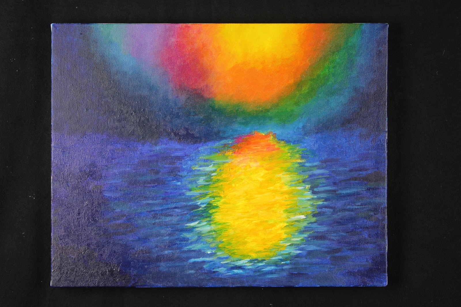
I think that my work shows an understanding of the style and mark making of the original strip because the brush strokes appear to be pretty similar, and my final painting resembles the strip pretty accurately. I tried to differentiate the areas of my painting where there were actual brush strokes that stood out individually from areas with blotting/mixing of the colors on the canvas, where there were less clear individual marks. I also did my best to replicate the colors of my original strip in my painting, by closely comparing the different shades of all of the colors that I used with the strip in order to make sure they were as similar as possible. Through the process of this project, I learned that it takes a lot of time and patience to create exactly the color you want, especially if you have a specific hue in mind that you are trying to match it with. Along these same lines, I also learned that it is extremely difficult to replicate a color that is already on your canvas if it had dried previously and is no longer on your palette to work with. I believe that my final canvas is extremely unified. I started out paying more attention to the center area with the sun and its reflection on the water, and put a lot of effort into perfecting the brush strokes and colors I used. However, after I had spent a lot of time on that one area, I realized that it was disproportional to the rest of the painting, so I then spent more time on the other areas of the painting, and concentrated on improving the brush strokes and colors I had used there. After this project, I feel very comfortable as a painter. I enjoy being able to create colors and manipulate them into exactly what I want, and I think that I have developed this skill through this project. I would be interested in further exploring this medium by painting in different styles, and experimenting with different subjects. One of the limitations that this medium poses for me is the issue of communicating space and distance––since it is a 2-dimensional painting, it is sometimes difficult to perfectly represent a 3-dimensional object, which I will have to work on in order to improve my painting techniques.
Monday, October 15, 2012
Learning to See: Final Blog Post


Monday, October 1, 2012
Line/Silhouette Drawings: Intentions


In the next few days as we create more sketches, I will focus on trying to bring together the elements of silhouette and line quality in order to produce a more complex, realistic sketch or design. For example, when I was beginning to draw a large tree trunk, I started by creating an outline of the basic shape of the trunk, and then I sort of filled it in with the most heavy lines that I saw in the bark of the tree. This produced an outline of the most basic marks on the trunk, which I liked because it wasn't a completely detailed drawing, but it still got the idea across and represented the tree trunk in its most basic form. I will also try to use the thickness/thinness of the lines that I draw in order to design shadows and highlights in my sketches.
Friday, September 21, 2012

Thursday, September 6, 2012
Contour Line Drawings Reflection
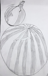
In my contour drawings, I think that I was able to pretty thoroughly explore the expressive qualities of line. Especially in my ink and water drawing, I tried to experiment with the thinness/thickness of my lines, as well as the darkness/lightness of the lines. I tried to put emphasis on lines that stood out to me when I looked at the object––especially shadows. I am pretty happy with the effect that this technique had on the end result of my drawing, because it made the oil can look more realistic and highlighted the parts of it that were highlighted in real life when I looked at the actual object itself. I felt really comfortable with the ink and water drawing, because I liked how it was pretty easy to manipulate the line in so many different ways with the brush I was using. This made it easier to create a drawing that really accurately represented the object. I also enjoyed that I had a lot of freedom to express the objects however I wanted, in order to convey a certain feeling or attitude to the viewer. I think that one of my strengths as a representational artist is my line quality, because I tried to put a lot of effort into how my lines came across on the paper, in order to understand exactly how a viewer might perceive my drawings.


Monday, June 4, 2012
Final Art Reflection
1. I believe that my two most successful works from this school year have been my texture sculpture and my gesture sculpture. My texture sculpture included rocks, toothpicks, feathers and cloth glued onto a wooden board, and my gesture sculpture was made out of hardened plaster.

 |

2. My texture sculpture stands out to me because I think that I did a good job of conveying texture to the viewer. As opposed to my drawing of textures, I think that this sculpture did a nice job of separating the textures from the objects that they are attached to, so that when the viewer sees the sculpture, the eye and brain are drawn not to the actual object that was glued down to the board, but to the textures contained in the objects. This was really the goal of the project--create a sculpture that highlights textures, not objects--and I think that I achieved this goal, which is why I think it was such a successful work for me. I especially think that I grew in my capacity to envision and express in this project, because in order for my sculpture to be successful I had to first envision what I wanted the outcome to be, and I had to figure out a way to express my vision to others via the materials I was given. For my gesture sculpture, I think that it was very successful, because I captured the gesture of the figure, but did not focus so much on the human figure itself. I spent a while trying to think of a way to create a sculpture that exemplified a specific gesture more than a general figure, and had to practice the "engage and persist" habit of mind in order to finally reach my goal and come up with this design.
3. I think that my least successful work was my texture collages. I really struggled with how to express textures through a digital medium, and it was hard for me to find a way to be successful with that. However, by doing other projects with texture (like the sculptures), I was able to learn from my mistakes with the digital form, and I think that I would be able to do a better job now.
4. I think that expressing and envisioning are my greatest strengths. It comes pretty naturally to me to visualize how I want a piece of art to turn out, and then I have to use my skills of expression in order to make that vision come to life on the canvas, in the photo, etc. They kind of go hand in hand, because without one you cannot really go anywhere with the other.
5. I think that I definitely gave it my all in most areas of this class--I have always loved art, and it's really fun for me and a nice way to relax sometimes. I have always tried my best with the given assignments, and done whatever I can to meet my goals. I know that sometimes I can get distracted in the classroom, but I am working on that and I think that I have improved.
6. I'm just excited to continue art class next year––I know that there are many schools without an art program available, and I feel extremely lucky to have such excellent resources at my fingertips. I look forward to continuing my passion for art, and also to receiving constructive criticism so that I can improve in my artistic abilities.
7. The skills that I have developed in the studio can definitely help me in places that are not specifically art class--just having the creative side of my brain stimulated regularly helps me concentrate in my classes, and I really enjoy having a creative outlet as a break from academic classes, which I can sometimes become stressed out over. Participating in art also allows me to have a more expansive understanding of how concepts relate to each other, and I can compare more abstract things that I otherwise could not.


In this project, I focused a lot on trying to capture the best perspective on a landscape, so that the viewer could really imagine what it would be like to stand where I was and view the scene with their own eyes. When I was drawing the landscape pictures with black ink, I focused on trying to use line and form to convey the feeling of the setting on paper. I found it to be harder than I thought it would be to get everything necessary into the image, but eventually I got the hang of it and I found that I actually really enjoyed it. I did have some trouble sometimes with remembering to draw the foreground first and then the background, so I sometimes ended up with an out-of-place line going through a tree which was supposed to be a part of the hill behind it. However, I usually found a way to incorporate it into the drawing and make it look intentional, which was a skill that I learned and was able to develop through this project. For the photographs, I liked the idea of a definitive foreground and background in an image, so I took pictures where the foreground and backgrounds contrasted nicely with each other. In the first photo of the book, the foreground is the plant growing out of the rock. I liked this because the plant is very slim and slender, but it still stands out because it is in front of everything else in the picture. In the second photo, I tried to contrast the two ends of a trail visible through the lens, although I don't think that this one was as successful as the first one. Overall, I really enjoyed this project and I learned a lot about the value of line and form in a landscape.


Monday, April 23, 2012
Sculpture Assessment
Tuesday, April 3, 2012
Sculpture: intentions

Wednesday, February 29, 2012
Value Project Final Post

For me, the drawing part of this project felt more comfortable. However, I think that this was only because I am more used to drawing, and have more experience with this. At first, it was hard for me to accurately capture the objects in the image, and transfer them to the paper with a pencil, but after looking at it for a while, I think that I was able to manage it. I also think that drawing allowed me more room for expression, because I could experiment with different pencil strokes to convey an emotion or feeling. To improve the results of the photo, I think that I could have been more careful to really focus my photo when I first took it, because it's difficult to focus it really clearly on the enlarger. With the drawing, I think that the results would have improved if I had focused a little more on making the blacks in my drawing darker, because there weren't many places in my drawing that were completely black, whereas in the actual composition there were several places where the shadows were so dark that you couldn't tell where one object ended and an adjacent one began.

Wednesday, February 15, 2012
Value Project: Drawing & Photo


Wednesday, January 11, 2012
Texture Sculpture
Monday, December 12, 2011
Texture Collages


2. Of the 10 photographs that I took, the image that I think best communicates the essence of a texture is the picture that I took of a tree's bark. It's really close-up and you can see all of the details in the wood. I think that it was successful because you can see all of the things that make the texture what it is––you can see the bumps and splinters that make it rough and the shadows that show the 3-dimensionality of it.
3. Of the collages that I created, I think that the most successful one was the one with all of the rubbings on it. I think this one was successful because it shows not only different shapes and objects, but also the textures within them––one of my favorite parts is the leaves on either side of the word in the middle, because they are clearly outlined, and you can easily see where the different parts of the leaves were based on the textures inside of them.
4. My most successful collage is also my favorite one. I really like the collage that I created with rubbings, because I like the mixture of both objects/actual things and the textures that they are made up of. I also like the way that it highlights the word "electric" by centering it in the middle of everything else, but it is not so highlighted that the viewer doesn't notice anything else in the collage.
5. In a 3-d representation of my 2-d collage, I think that it will be important to use objects that have clear textures, so that the end result will be interesting to look at and see a variety of different textures. I also think it might be interesting to blend the textures more than I did in the collages, because that will create even more textures than I began with.
Monday, November 14, 2011
Color Project

Subscribe to:
Posts (Atom)