Monday, November 26, 2012

Painting Strip Project

Original Painting: Monet, Houses of Parliament

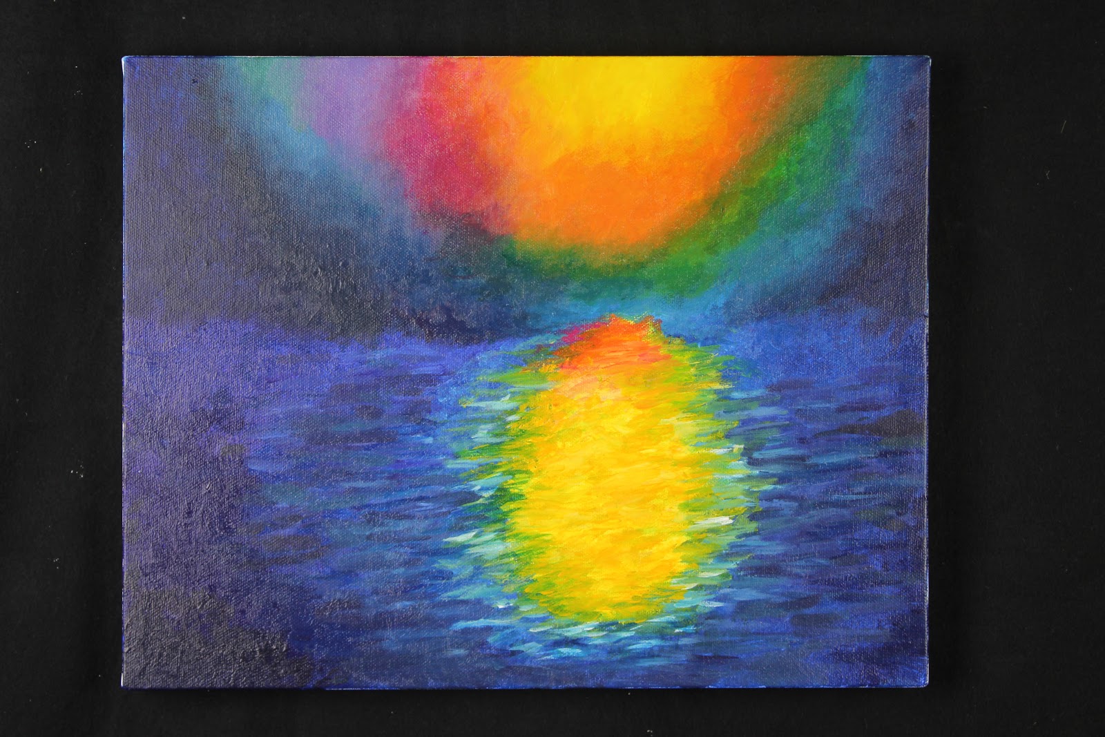
I think that my work shows an understanding of the style and mark making of the original strip because the brush strokes appear to be pretty similar, and my final painting resembles the strip pretty accurately. I tried to differentiate the areas of my painting where there were actual brush strokes that stood out individually from areas with blotting/mixing of the colors on the canvas, where there were less clear individual marks. I also did my best to replicate the colors of my original strip in my painting, by closely comparing the different shades of all of the colors that I used with the strip in order to make sure they were as similar as possible. Through the process of this project, I learned that it takes a lot of time and patience to create exactly the color you want, especially if you have a specific hue in mind that you are trying to match it with. Along these same lines, I also learned that it is extremely difficult to replicate a color that is already on your canvas if it had dried previously and is no longer on your palette to work with. I believe that my final canvas is extremely unified. I started out paying more attention to the center area with the sun and its reflection on the water, and put a lot of effort into perfecting the brush strokes and colors I used. However, after I had spent a lot of time on that one area, I realized that it was disproportional to the rest of the painting, so I then spent more time on the other areas of the painting, and concentrated on improving the brush strokes and colors I had used there. After this project, I feel very comfortable as a painter. I enjoy being able to create colors and manipulate them into exactly what I want, and I think that I have developed this skill through this project. I would be interested in further exploring this medium by painting in different styles, and experimenting with different subjects.  One of the limitations that this medium poses for me is the issue of communicating space and distance––since it is a 2-dimensional painting, it is sometimes difficult to perfectly represent a 3-dimensional object, which I will have to work on in order to improve my painting techniques.

Monday, October 15, 2012

Learning to See: Final Blog Post

In this project, I focused a lot on my ability to use line quality to express a subject, and using different thicknesses of lines in order to create a drawing that accurately expressed what I was looking at. I began by observing a tree outside, and looking at the texture of its bark, and how it was composed of a lot of lines of very different qualities and values, and how they came together in sort of swirls and uniquely different shapes. I developed this craft by drawing the tree several times, and each time I used a different way of expressing the lines on the bark of the tree trunk. In my first drawing, I used a lot of thin lines really close together. In my second, I tried spacing out the areas of detail in the trunk, in order to try to portray the curves and depth of the tree, and all of the knobs on the wood. Then in my third (and final) drawing, I used a variety of different lines that were both thin and thick, and incorporated the knobs into the lines as well. For my first drawing, I used pencil, and for my second two I used a paintbrush with ink. I really liked working with the ink and paintbrush for my drawings, because it allowed me to easily make different line thicknesses, and express the lines the way that I wanted to. I think that I was able to combine my own sense of expression into my representation of shapes pretty well in my third drawing, because for some of the tree trunk area I sort of improvised the curves in the bark, and I was able to add my own lines into the tree. I think that through this project, one of my strengths as a representational artist has been observing the different depths of a subject, and manipulating the quality/value of a line in order to accurately portray them in my drawings.

Monday, October 1, 2012

Line/Silhouette Drawings: Intentions


In the next few days as we create more sketches, I will focus on trying to bring together the elements of silhouette and line quality in order to produce a more complex, realistic sketch or design. For example, when I was beginning to draw a large tree trunk, I started by creating an outline of the basic shape of the trunk, and then I sort of filled it in with the most heavy lines that I saw in the bark of the tree. This produced an outline of the most basic marks on the trunk, which I liked because it wasn't a completely detailed drawing, but it still got the idea across and represented the tree trunk in its most basic form. I will also try to use the thickness/thinness of the lines that I draw in order to design shadows and highlights in my sketches.

Thursday, September 6, 2012

Contour Line Drawings Reflection

In my contour drawings, I think that I was able to pretty thoroughly explore the expressive qualities of line. Especially in my ink and water drawing, I tried to experiment with the thinness/thickness of my lines, as well as the darkness/lightness of the lines. I tried to put emphasis on lines that stood out to me when I looked at the object––especially shadows. I am pretty happy with the effect that this technique had on the end result of my drawing, because it made the oil can look more realistic and highlighted the parts of it that were highlighted in real life when I looked at the actual object itself. I felt really comfortable with the ink and water drawing, because I liked how it was pretty easy to manipulate the line in so many different ways with the brush I was using. This made it easier to create a drawing that really accurately represented the object. I also enjoyed that I had a lot of freedom to express the objects however I wanted, in order to convey a certain feeling or attitude to the viewer. I think that one of my strengths as a representational artist is my line quality, because I tried to put a lot of effort into how my lines came across on the paper, in order to understand exactly how a viewer might perceive my drawings.

Monday, June 4, 2012

Final Art Reflection

 1. I believe that my two most successful works from this school year have been my texture sculpture and my gesture sculpture. My texture sculpture included rocks, toothpicks, feathers and cloth glued onto a wooden board, and my gesture sculpture was made out of hardened plaster.

2. My texture sculpture stands out to me because I think that I did a good job of conveying texture to the viewer. As opposed to my drawing of textures, I think that this sculpture did a nice job of separating the textures from the objects that they are attached to, so that when the viewer sees the sculpture, the eye and brain are drawn not to the actual object that was glued down to the board, but to the textures contained in the objects. This was really the goal of the project--create a sculpture that highlights textures, not objects--and I think that I achieved this goal, which is why I think it was such a successful work for me. I especially think that I grew in my capacity to envision and express in this project, because in order for my sculpture to be successful I had to first envision what I wanted the outcome to be, and I had to figure out a way to express my vision to others via the materials I was given. For my gesture sculpture, I think that it was very successful, because I captured the gesture of the figure, but did not focus so much on the human figure itself. I spent a while trying to think of a way to create a sculpture that exemplified a specific gesture more than a general figure, and had to practice the "engage and persist" habit of mind in order to finally reach my goal and come up with this design.

3. I think that my least successful work was my texture collages. I really struggled with how to express textures through a digital medium, and it was hard for me to find a way to be successful with that. However, by doing other projects with texture (like the sculptures), I was able to learn from my mistakes with the digital form, and I think that I would be able to do a better job now. 

4. I think that expressing and envisioning are my greatest strengths. It comes pretty naturally to me to visualize how I want a piece of art to turn out, and then I have to use my skills of expression in order to make that vision come to life on the canvas, in the photo, etc. They kind of go hand in hand, because without one you cannot really go anywhere with the other. 

5. I think that I definitely gave it my all in most areas of this class--I have always loved art, and it's really fun for me and a nice way to relax sometimes. I have always tried my best with the given assignments, and done whatever I can to meet my goals. I know that sometimes I can get distracted in the classroom, but I am working on that and I think that I have improved.

6. I'm just excited to continue art class next year––I know that there are many schools without an art program available, and I feel extremely lucky to have such excellent resources at my fingertips. I look forward to continuing my passion for art, and also to receiving constructive criticism so that I can improve in my artistic abilities.

7. The skills that I have developed in the studio can definitely help me in places that are not specifically art class--just having the creative side of my brain stimulated regularly helps me concentrate in my classes, and I really enjoy having a creative outlet as a break from academic classes, which I can sometimes become stressed out over. Participating in art also allows me to have a more expansive understanding of how concepts relate to each other, and I can compare more abstract things that I otherwise could not.

 In this project, I focused a lot on trying to capture the best perspective on a landscape, so that the viewer could really imagine what it would be like to stand where I was and view the scene with their own eyes. When I was drawing the landscape pictures with black ink, I focused on trying to use line and form to convey the feeling of the setting on paper. I found it to be harder than I thought it would be to get everything necessary into the image, but eventually I got the hang of it and I found that I actually really enjoyed it. I did have some trouble sometimes with remembering to draw the foreground first and then the background, so I sometimes ended up with an out-of-place line going through a tree which was supposed to be a part of the hill behind it. However, I usually found a way to incorporate it into the drawing and make it look intentional, which was a skill that I learned and was able to develop through this project. For the photographs, I liked the idea of a definitive foreground and background in an image, so I took pictures where the foreground and backgrounds contrasted nicely with each other. In the first photo of the book, the foreground is the plant growing out of the rock. I liked this because the plant is very slim and slender, but it still stands out because it is in front of everything else in the picture. In the second photo, I tried to contrast the two ends of a trail visible through the lens, although I don't think that this one was as successful as the first one. Overall, I really enjoyed this project and I learned a lot about the value of line and form in a landscape.